Avocademy —
Task management app
My role
UX Research
UX/UI Design
Prototyping
Usability Testing
Course
Avocademy UX/UI Design
Year
2023
About the course
I did this project on the Avocademy UX/UI design course. I took the course to improve my UX research skills and broaden my understanding of other UX design methodologies to become a more well-rounded designer.
Challenge
In our busy lives, it can be challenging to manage all the things we want to do. We often forget to be specific about what we want to do and fail to realistically plan and prioritize our to-dos, which prevents us from achieving our goals. My role was to address this with an MVP app.
Solution
The Checkd app helps you manage and follow through on the things you want to do. Checkd lets you easily create, view, plan, and organize your tasks and helps you remember them as well.
1. Discovery
Secondary Research
To better understand the problem, I looked at several expert articles and identified some common pitfalls that keep us from getting things done:
- Setting unrealistic expectations by creating long overwhelming to-do lists or aiming for big immediate changes.
- Being too goal-oriented, and hereby not defining what steps we need to be taking to reach our goals.
- Forgetting to take action because we haven’t created reminders for ourselves.
Interviews
To make sure I would interview relevant people I distributed a screener survey and identified 5 people who found it particularly challenging and wanted to get better at completing tasks.
I then interviewed these 5 participants to better understand their motivations, experiences, and pain points regarding task management.

Synthesis
To make sense of the observations I grouped and analyzed the data, and organized the findings in visual empathy maps and personas.
Affinity Map
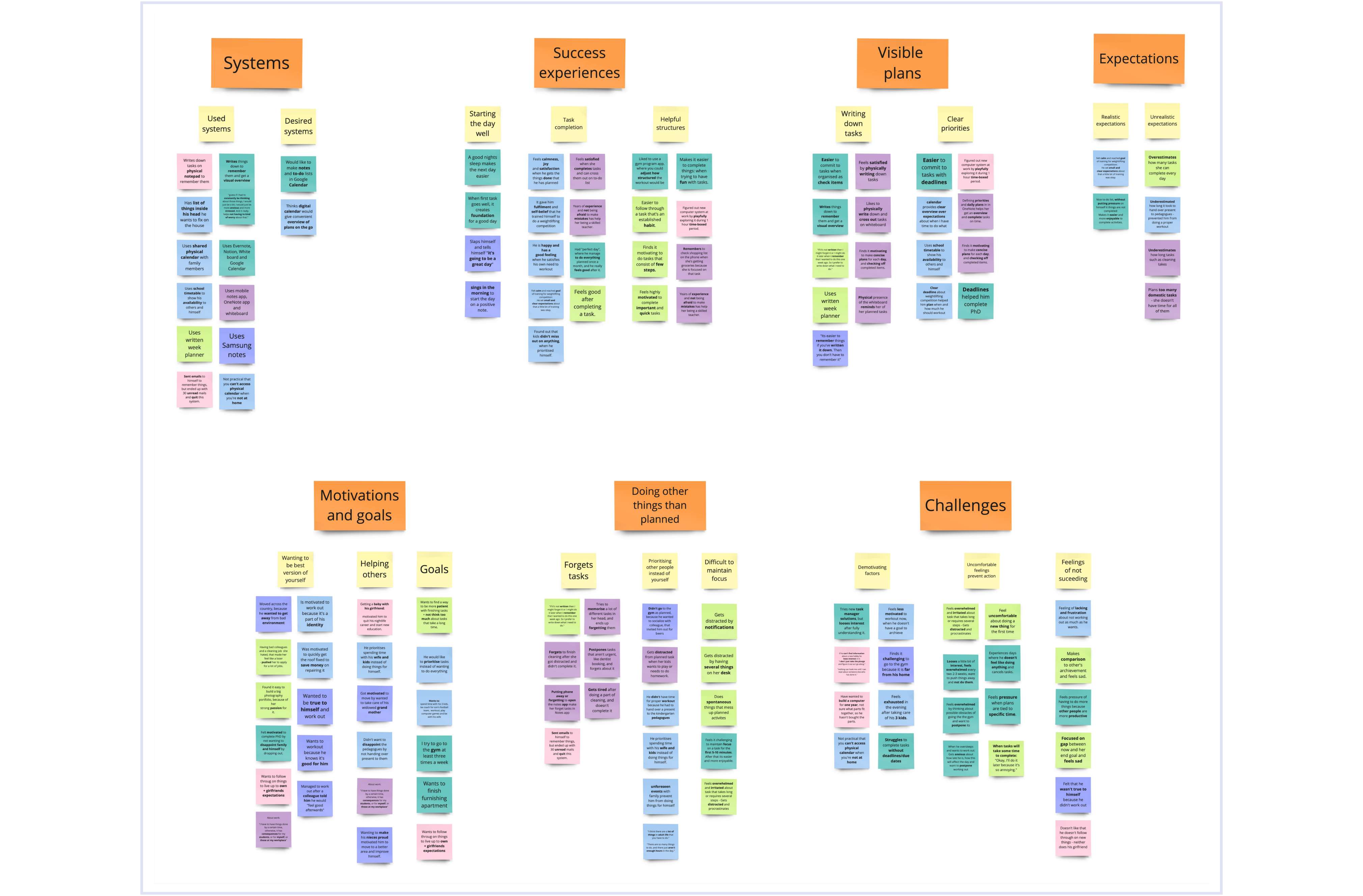
To get a visual overview of the data I grouped it into themes.
Identifying the user needs
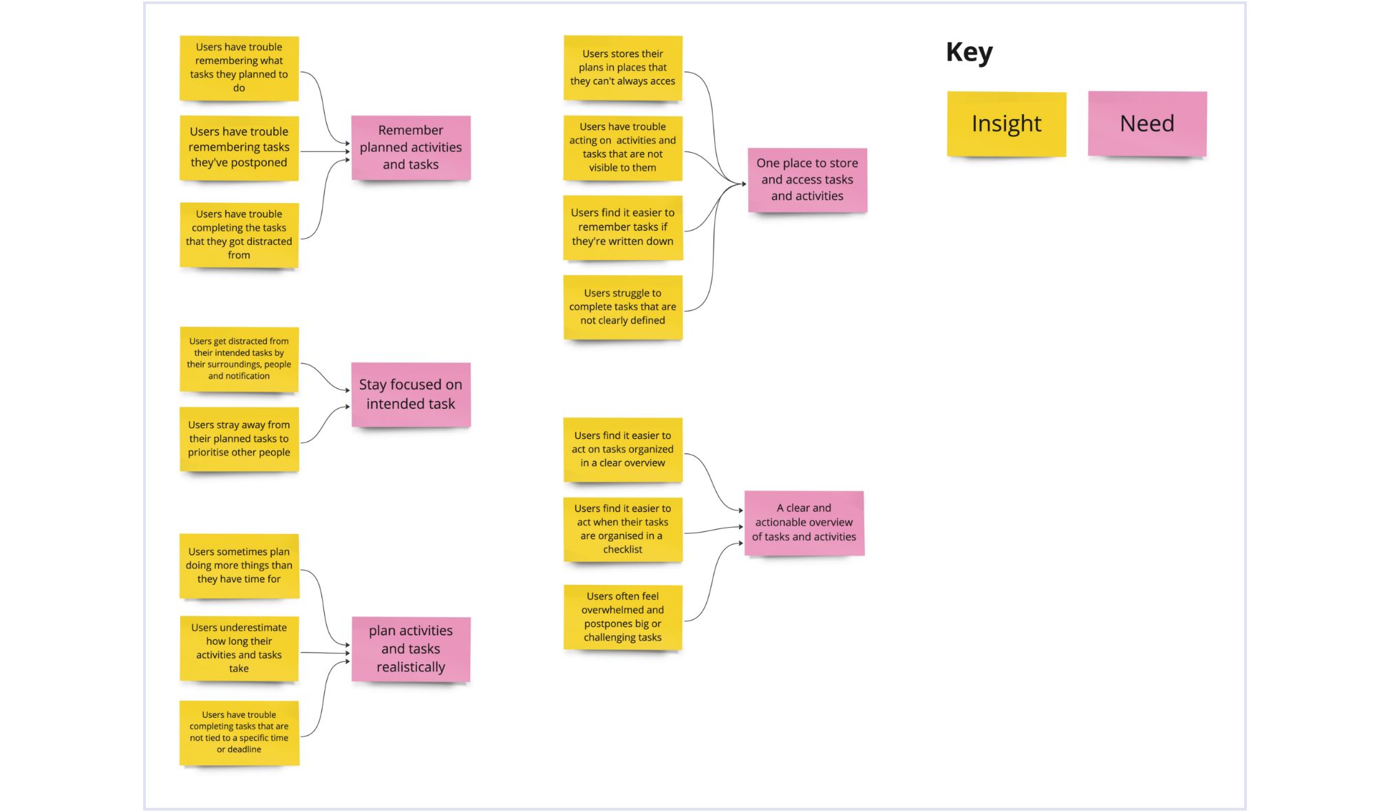
Looking at the themes I noticed patterns in the data. And I identified that the main user needs were centered around having one place to access tasks, a clear actionable overview of our tasks, realistic planning, and staying focused on completing planned tasks.
Empathy Maps
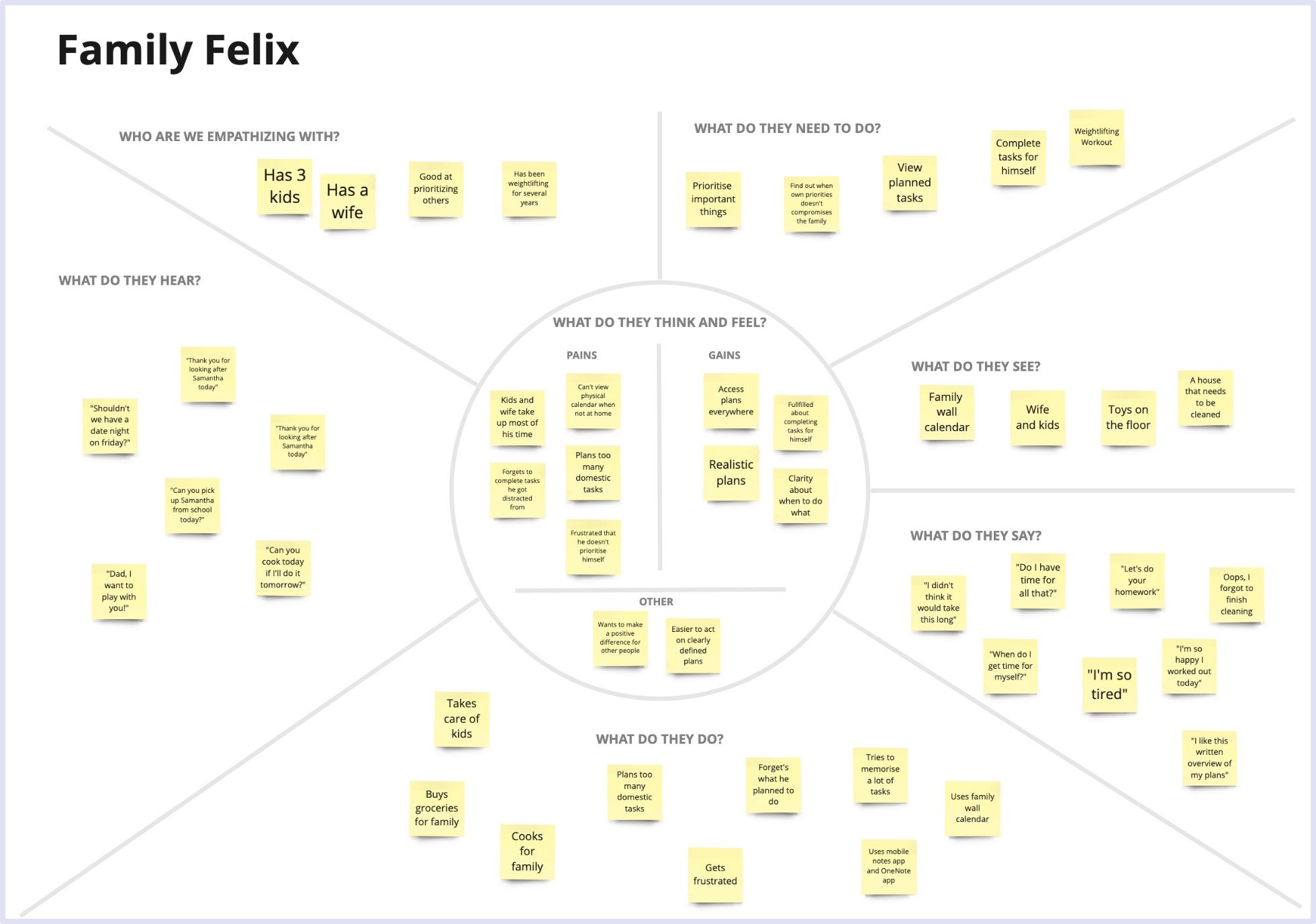
The findings enabled me to identify two types of users. To get a deep understanding of the users’ reality and characteristics I created empathy maps for the two user types:
- Family Felix who finds it difficult to find time for himself
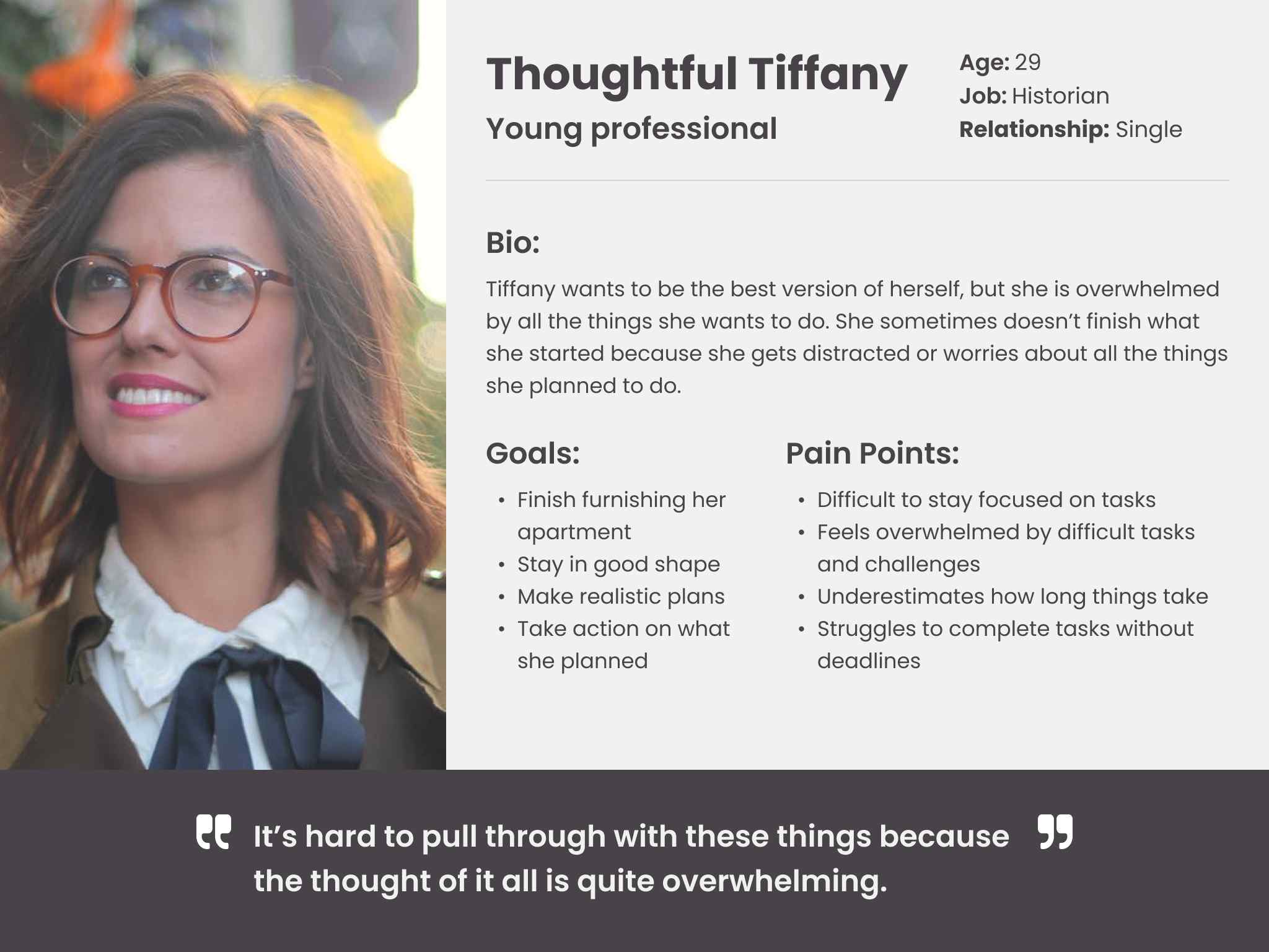
- Thoughtful Tiffany who gets overwhelmed by all the challenging things she wants to do

Personas
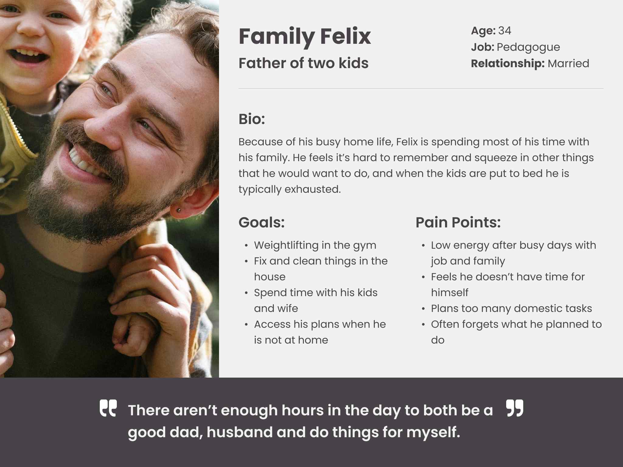
Based on the user characteristics in the empathy maps I created personas to get an easily understandable picture of the user groups I would design for.
2. Ideation
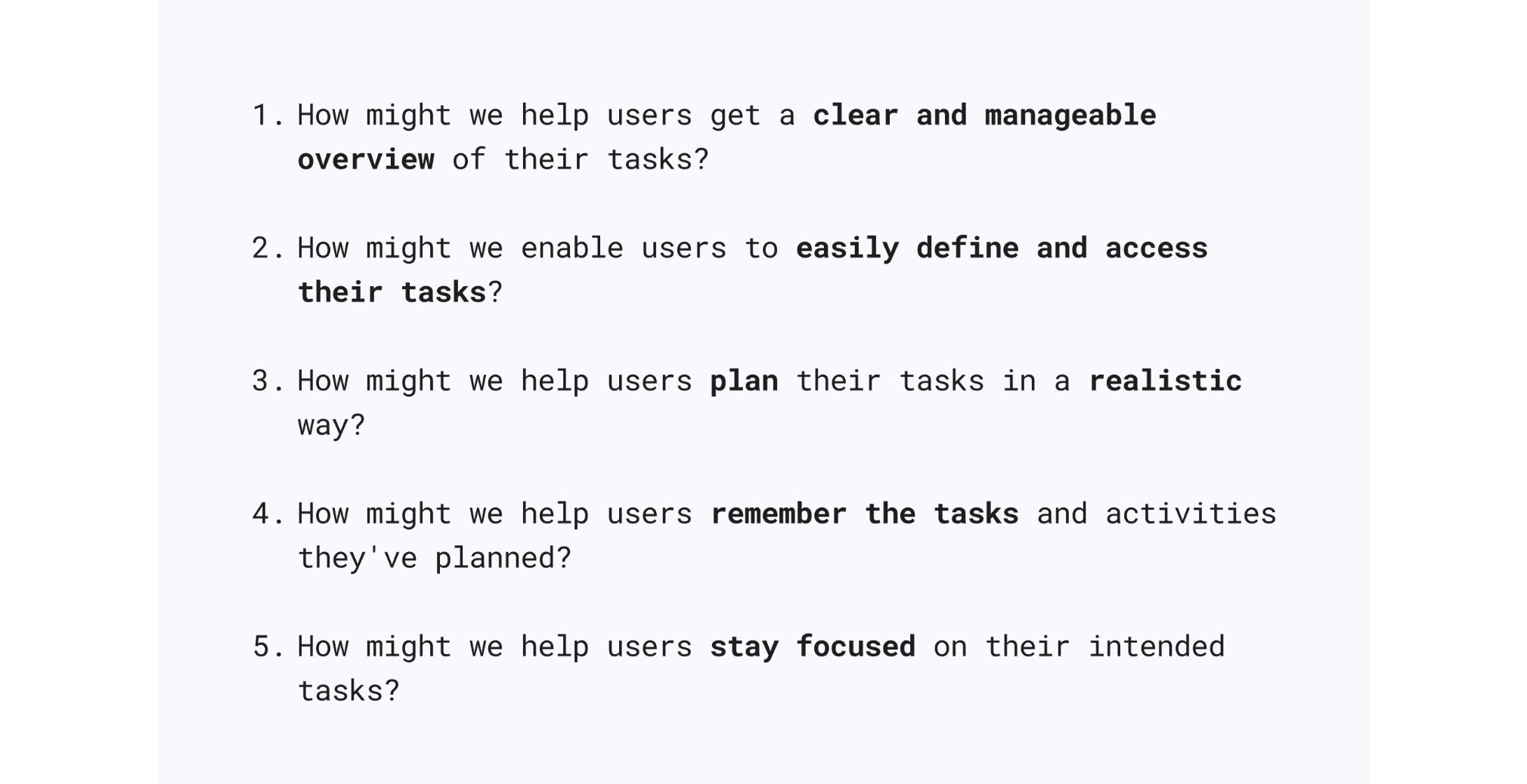
Problem Statements
To find out what problems I would address I created these problem statements based on my findings:
Brainstorm
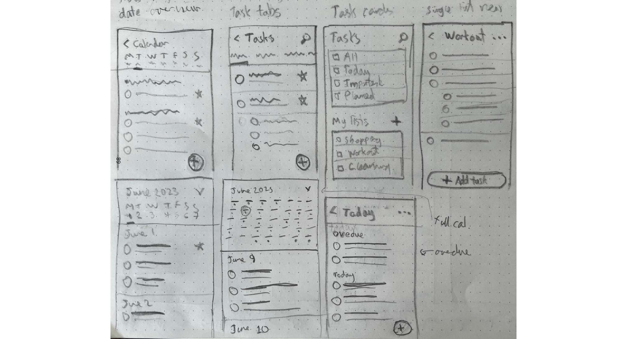
I then explored a large number of solutions to the problems by generating a lot of rough ideas with Google’s Crazy 8’s sketching technique.
User stories
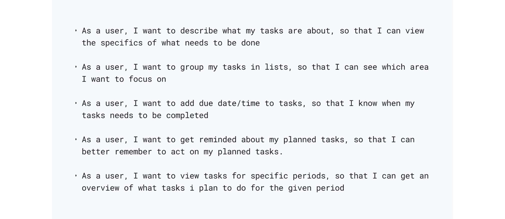
To find out what specific user needs I could accommodate with my design I created user stories and prioritized them to define which ones would create the biggest value.
Sitemap
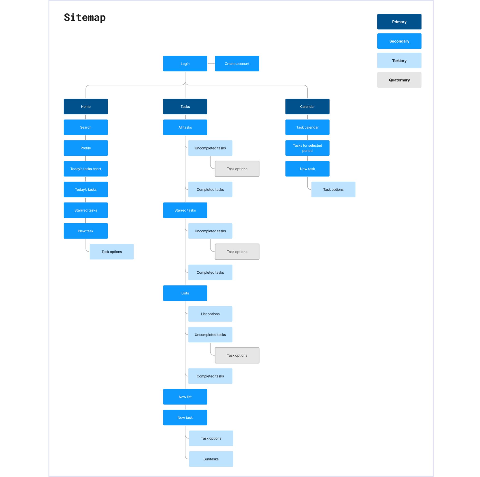
Looking at the user stories and my explorations I mapped out how I would organize the content. I went for the three pages “Home”, “Tasks”, and “Calendar” to make sure you could easily navigate between these pages to find the main features.
User flows
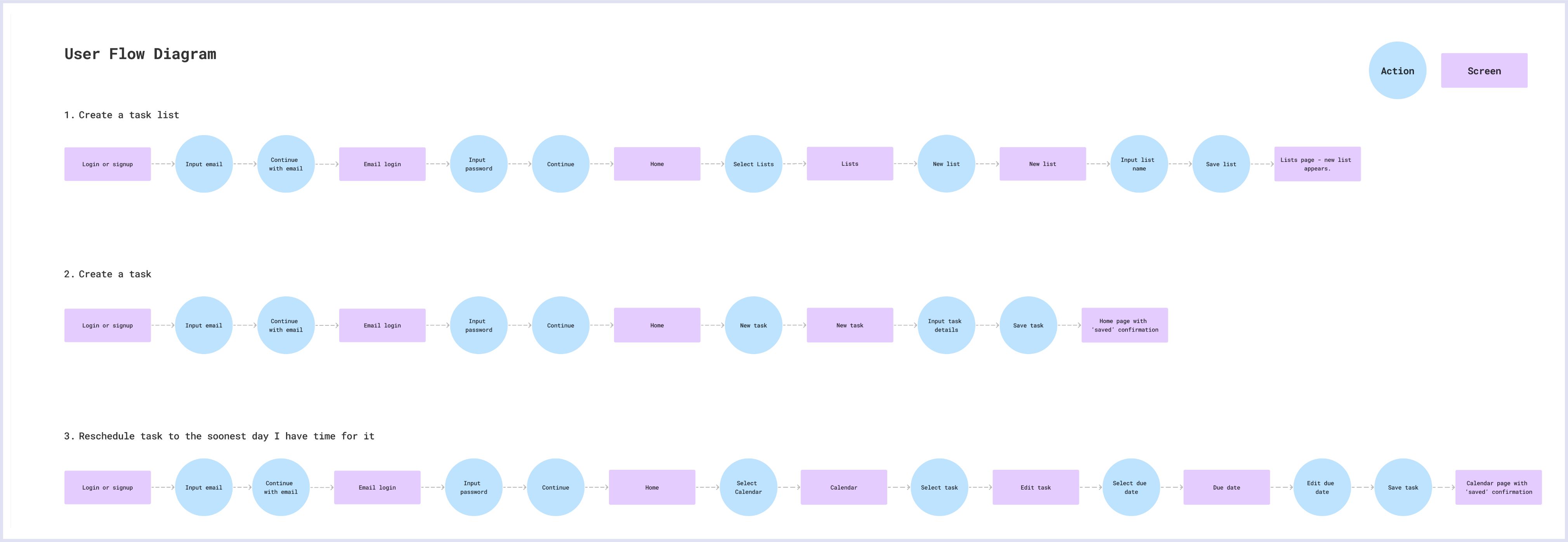
I then created user flows to define what paths users will take to complete the 3 most important tasks in the app:
1) Create a task list, 2) Create a task, 3) Edit and reschedule a task. These flows were important as they go through the most commonly used features and pages.
Sketches
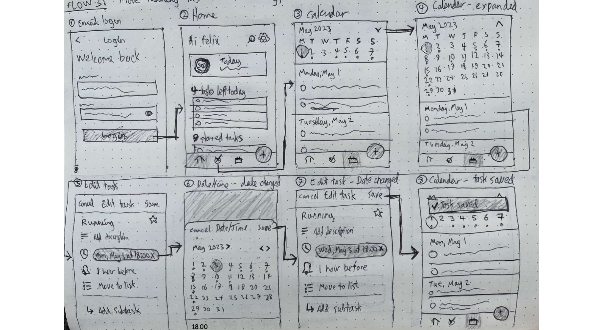
After settling on the flows I iterated on my brainstorming sketches, and did a lot of more detailed sketches to decide on a loose structure for how I would lay out the screens.
3. Design
Wireframes
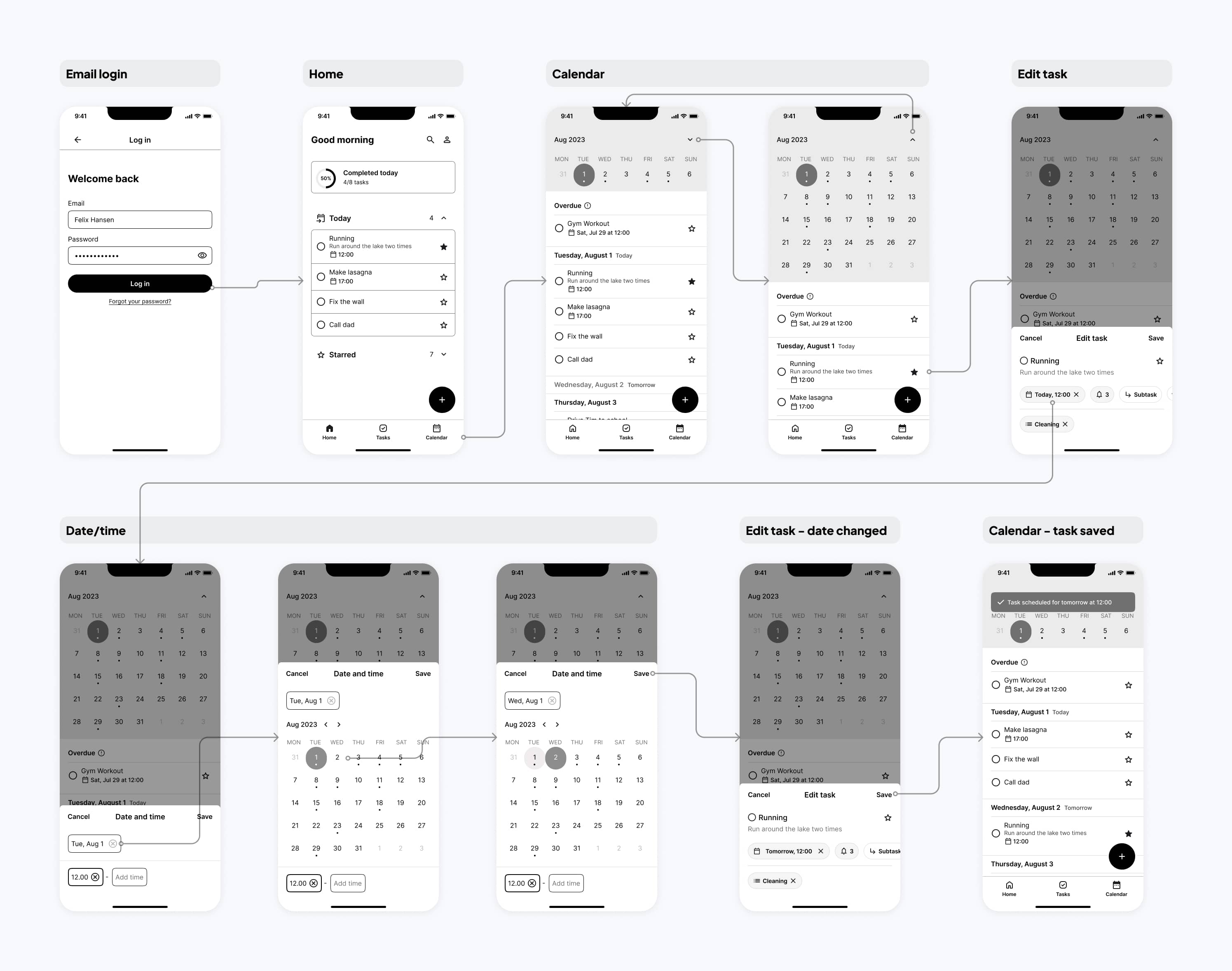
Using the sketches as a guide I created wireframes to get clear on what patterns, components, and layout I would use for all the pages and functionalities.
I changed the create/edit task feature from a fullscreen page to a bottom sheet for a more lightweight experience.
Mood board
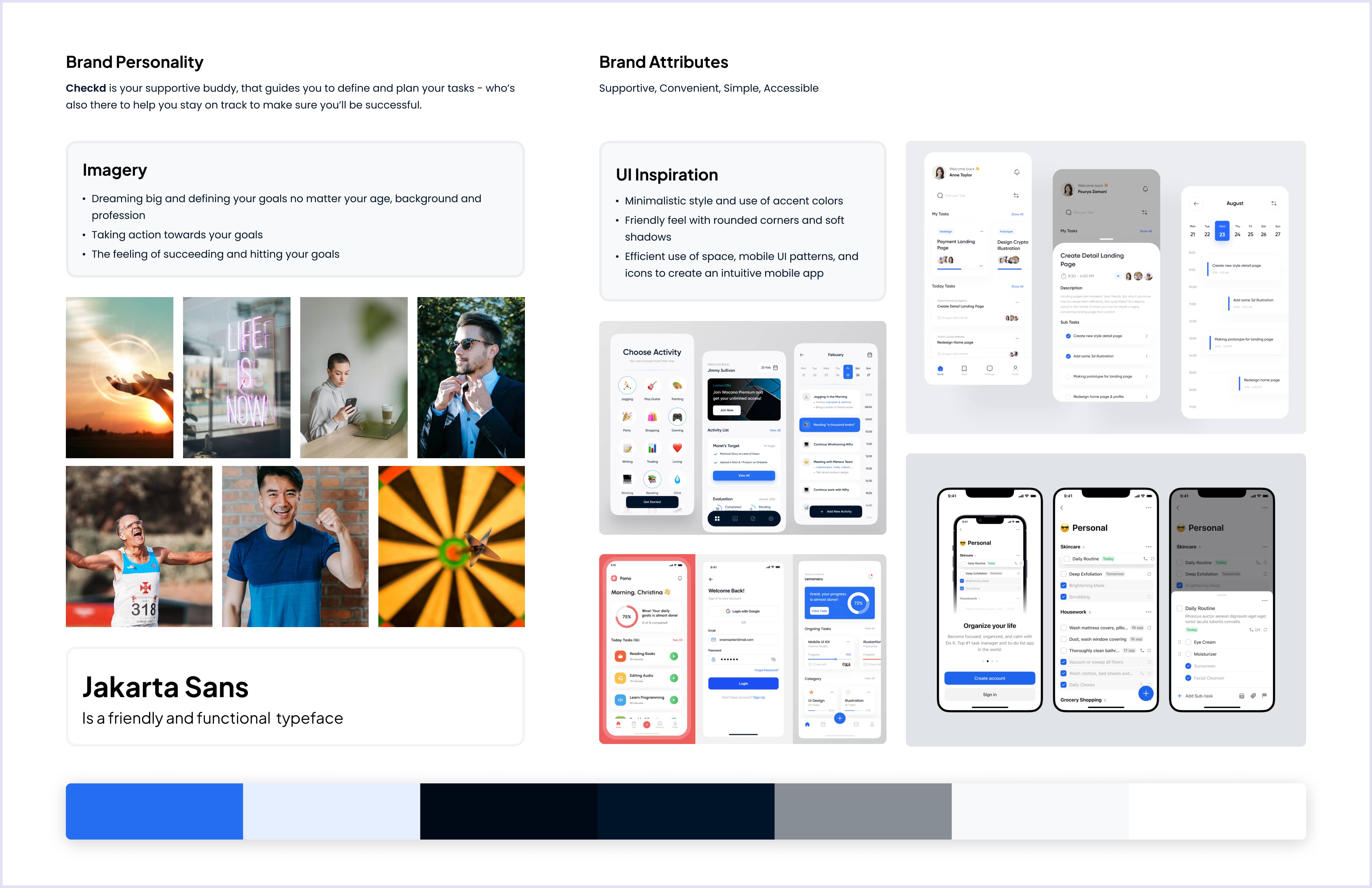
To set the tone for the brand and visual direction of the app I created a mood board. The brand name is Checkd because the Checkd app lets you check, plan, and remember your task, so you in the end can check them off. The minimalistic feel helps you focus on your tasks without getting overwhelmed by disturbing visuals. The blue accent color emphasizes interactive actions such as buttons, and mobile-friendly design patterns such as bottom sheets and floating actions buttons ensure a smooth, convenient experience.
Style guide
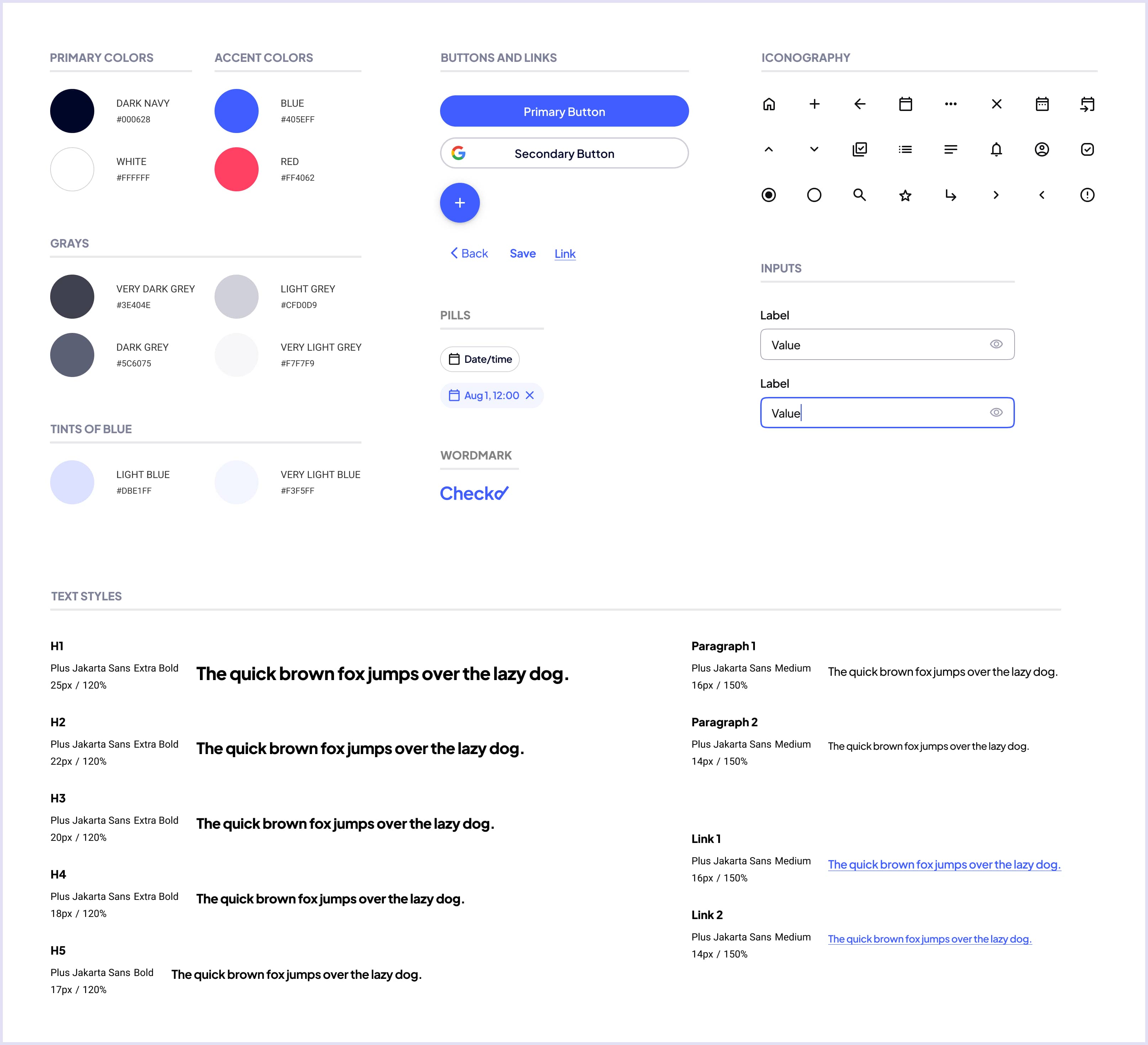
Based on the direction set in the mood board I created a style guide to define the use of colors, text styles, and components. I reused all the elements of the style guide throughout the entire app to ensure a consistent experience.
High-fidelity Screens
Using all the building blocks from the style guide I translated the rough wireframes into high-fidelity screens to create a polished, production-ready design of the app.

Prototype
I created an interactive prototype using Figma to bring the app to life. I created and tested all the interactions between the different screens to make sure the prototype was ready to be utilized for a usability test on real users.
4. Test
Usability Test
To learn what usability issues users might experience when using the app I conducted 5 remote moderated usability tests on users who have either used or have expressed interest in using task management apps.
The users tested the three main flows of the app:
1) Creating a task list, 2) Creating a task, 3) Rescheduling a task
Issues and improvements
The feedback was positive but also showed some usability issues I needed to address.
Main Usability Issues:

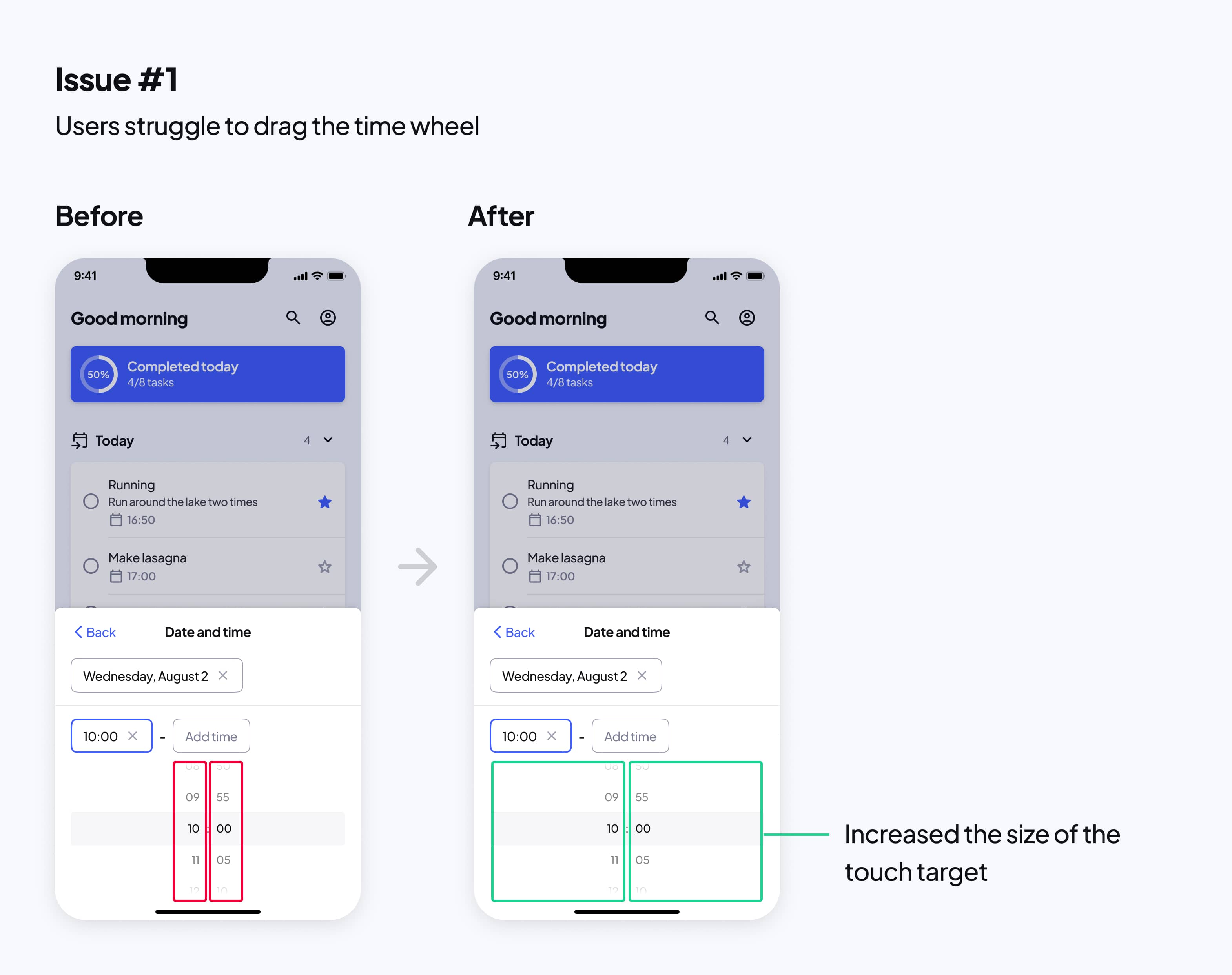
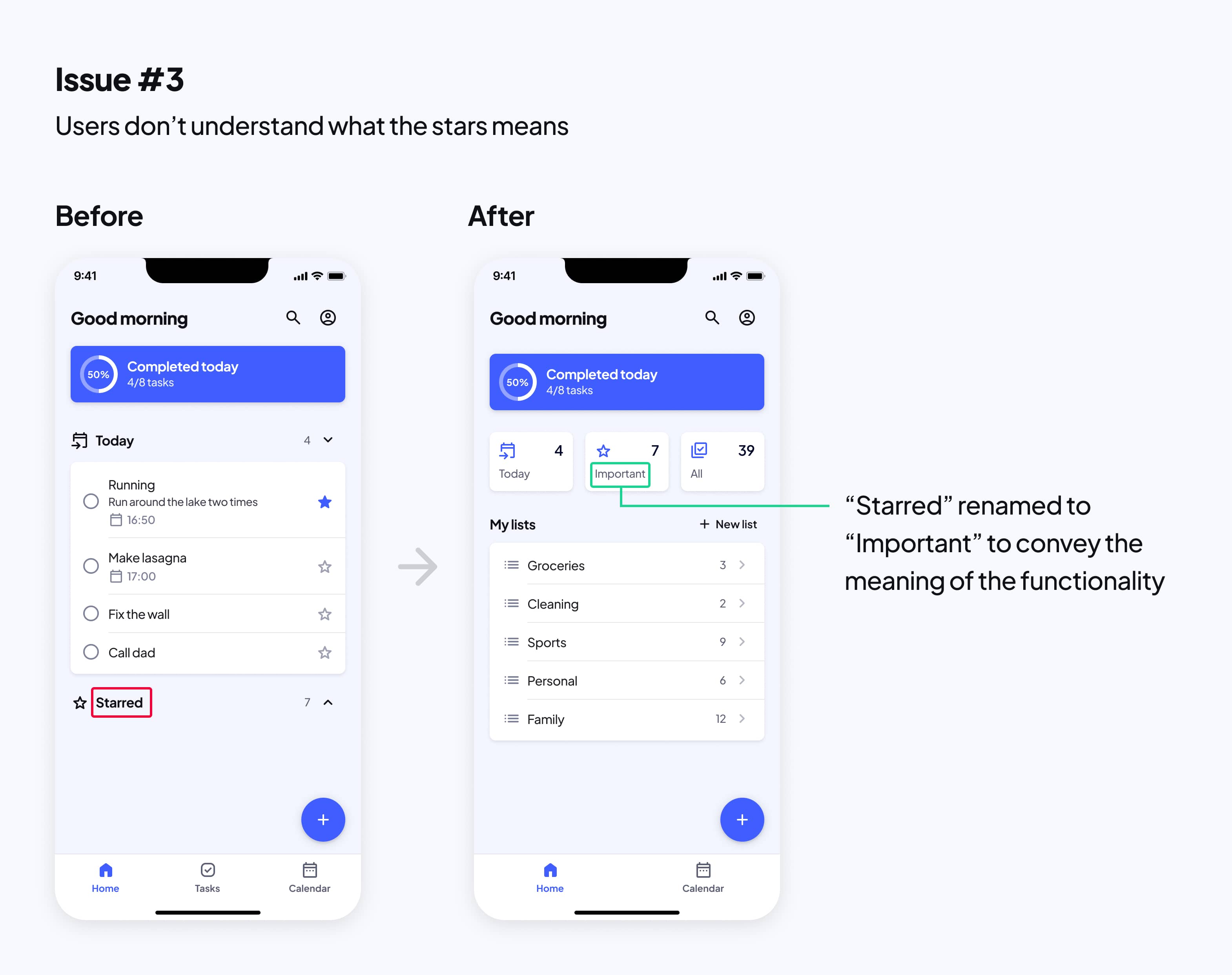
The issues were generally that users had trouble finding, understanding, and interacting with a couple of the features. This is how I addressed the issues:

5. Reflection
Looking ahead
Given more time I would like to test more of the concepts that the usability test results inspired me to come up with:
- Users rarely visited the Calendar page, so I’d be curious to test if emphasizing the calendar less by storing it in a “scheduled” category in a single-page structure would be useful.
- To address the need to remember tasks I’d like to test if reminders about today’s tasks would be desired.
