SimplyJob —
Redesign of a job app
My role
Design
User Experience
Prototyping
User testing
Client
SimplyJob
Year
2019-21
About the project
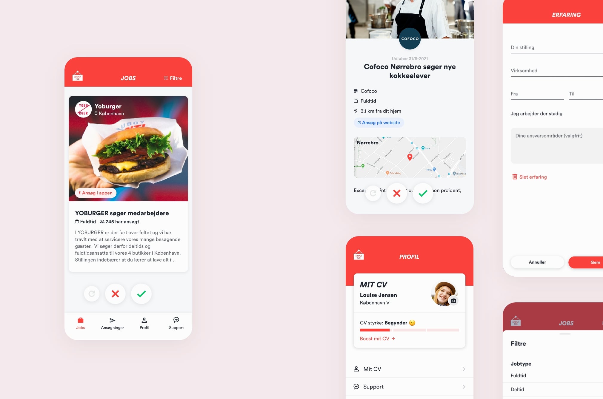
In the SimplyJob app, users can swipe their way to their next job. The company had a feeling that the app could be more intuitive, but didn’t know how to make it happen. My job was to understand the user’s needs and address them with my design. I would redesign the app while tweaking the existing visual identity, hold feedback meetings with the management, handle user testing, and communicate with developers. And later I also designed new features.
Understanding the users
To understand the users I created job stories, that clarify the users’ situation, motivation and expected outcome from using the app.
Overall job story, SimplyJob app —
Finding the pain points
To identify what the existing app was lacking I conducted a user test and did a UX review of the old app.

Creating the concept
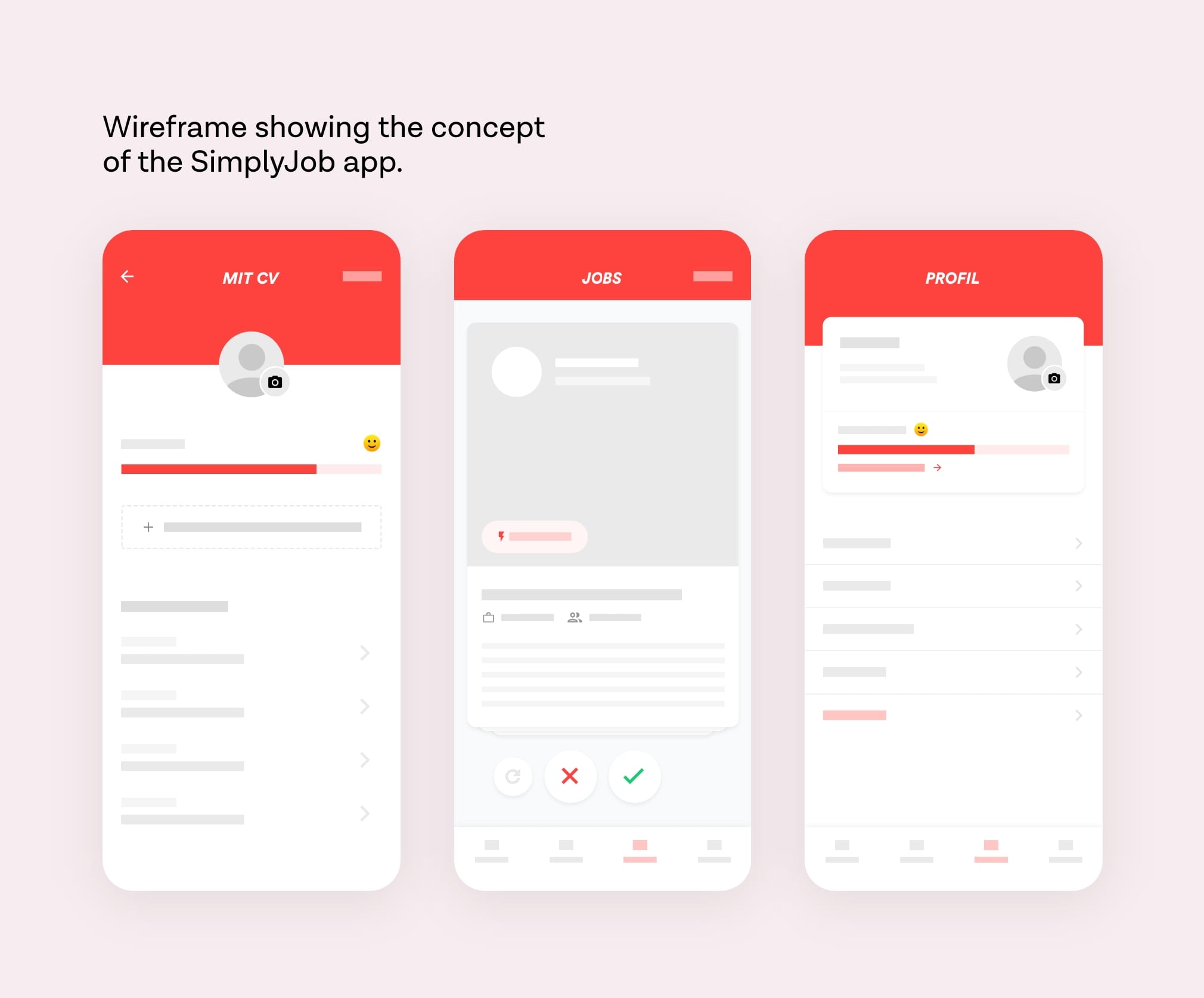
I used clear colors, icons, and simple navigation to make a design that’s intuitive to use. After deciding on the concept of the app I designed an interactive prototype, that we used for a user test to ensure the app was easy to use. The feedback was quite positive (yes!), and I finalised the design.

Job search made simple
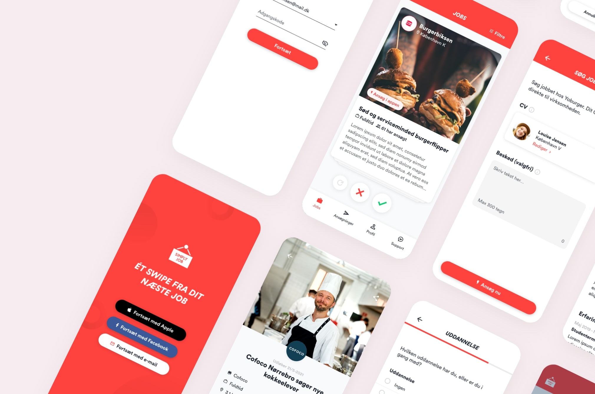
When the redesign was done we had an app that was easier to use, looked cooler, and met the user’s needs to easily apply for jobs on their phone.




Improvements
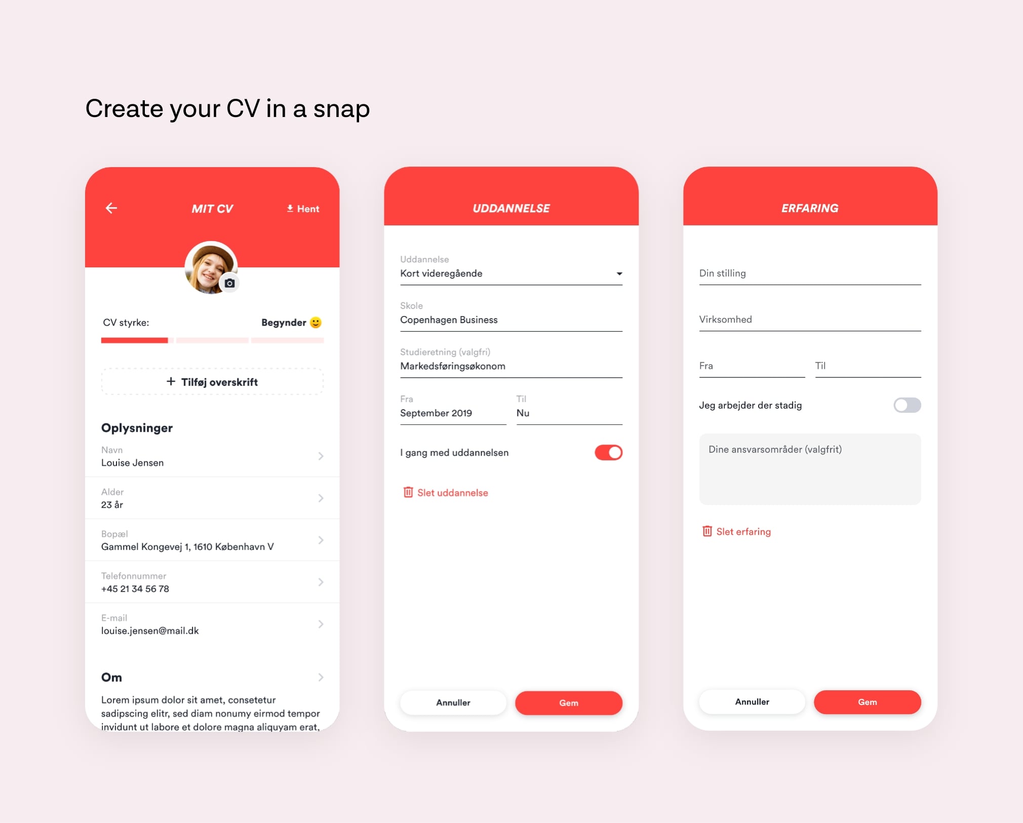
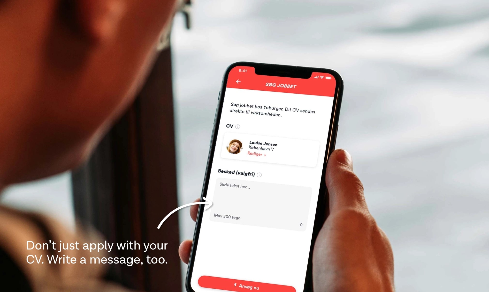
Along the way, it was my task to design new features and UX improvements based on feedback from user tests and ideas from the SimplyJob team. Here are some of them.

Rasmus Ulveman
CEO @ SimplyJob
Nicolai is a skilled UX designer. He works thoroughly and structured and has an exceptional ability to simplify things and cut to the chase in relation to what is important to the user of the product. Nicolai is also self-driven and good at working from home.