Findbank —
Bank dashboard redesign
My role
Design
User Experience
Prototyping
Client
Findbank
Year
2018
About the project
Findbank helps people find and switch to the bank that’s best for them. Findbank had already built a dashboard, where the banks could manage and contact the Findbank users, who wanted a better bank. But the visual identity was not up-to-date and it didn’t work on small laptops or tablets. I would give the dashboard a more modern visual identity, make the interface a tad more intuitive and ensure it would work on smaller screens, while also handling all the communication with the development team.

Reviewing the current design
To begin with, I reviewed the current design to find out what needed to be improved.

A more joyful banking experience
I presented wireframes like the one below to show the company the overall layout and feel of my design.

A brighter visual identity
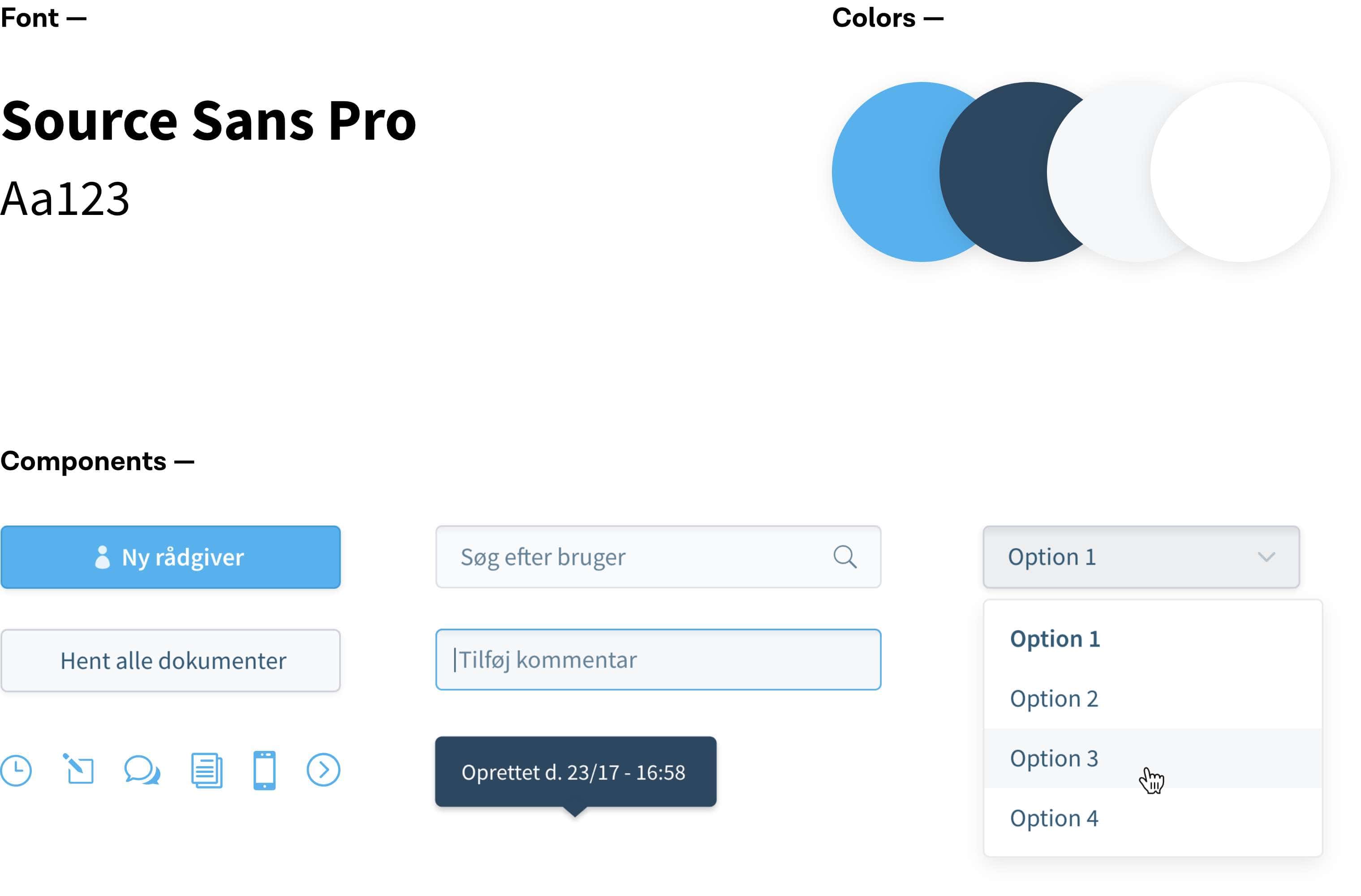
I wasn’t allowed to differ too much from the old identity. But I chose a more rounded humanist font, brighter colors, and more friendly icons to give the dashboard a brighter feel.

A seamless banking experience
The redesign received positive feedback from Findbank and the users. It gave the bank users a seamless, user friendly and tablet-compatible experience, which provided Findbank with a strong, new selling point.


Kasper Kjems
CEO @ Findbank
Nicolai possesses a sharp eye for design and UX, where user experience and the concept is always in 100% focus. Nicolai is good at putting himself in the user’s place, optimizing existing designs, or creating them from scratch. Best recommendations from here!